Improving UX
Improving UX is Consistency, Readability, Speed, Relevance, and Functionality.
When you first see a website, you’re immediately confronted with the look and feel of the design; the overall aesthetic is your first impression, and it’s often what makes a user want to explore further.
As such, it’s an essential element to a good design. But it sometimes starts to overshadow the second and equally important component to a good website: its functionality.
A great user experience is far more dependent on how the site works than how it looks, so take a minute to make sure that your work is up to scratch, and that you’re holding true to the five essential principles of improving UX design outlined below.
Consistency
Keep the most interactive elements of your website as consistent and user-friendly as possible.
Although there’s plenty of room for creativity in the aesthetic areas of your site, err on the side of caution when it comes to the interactive elements, like buttons, links, navigation panels, or forms. Ecommerce sites are often a great place to look for inspiration, because they have so many different products and pages that need to be assembled in a consistent manner so the shopping experience isn’t confusing. Take some tips from this site:
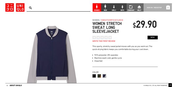
- Information is more palatable when it’s highlighted in the same way; here, the buttons, categories, and other useful text are all red.
- The layout should remain as similar as possible for pages that have similar content.
Readability
Web users tend to skim pages, pausing on interesting content rather than reading all the way through.
Eye tracking studies have shown that most users start at the upper left-hand corner and skim downwards. Eye-catching elements like headlines, pull-quotes, or images are briefly taken in, and the associated content is only delved into if it provokes sufficient interest. Designs need to accommodate this habit by adding lots of visual pauses, such as the ones seen in this blog:
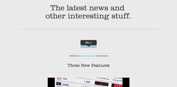
- Plenty of white space
- Large images
- Icons, which are especially effective for adding visual interest to lists
- Variegated typefaces and type sizes
- Large, intriguing titles
Speed
If your pages load too slowly, the best UX in the world won’t save your site.
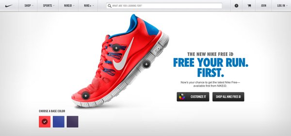
Plenty of studies have shown that slow sites are no longer tolerated by most web users; 25% of people will abandon a site if it takes longer than 4 seconds to load. So make sure you’re following in the steps of savvy ecommerce sites, and employ these techniques:
- Use a site speed testing tool to determine where your site stands.
- Group images into CSS Sprites, and CSS and Javascript files into masters, in order to reduce the number of files that need to be loaded.
- Go for a sleek, minimal look; not only do fewer effects make for faster sites; the stripped-down style is also of-the-moment.
- Track your bounce rate with Google Analytics to measure the effects of your changes. If you need help setting it up, refer to this Google Analytics guide.
Relevance
A great UX can be taken to the next level with a design that’s customized for your audience.
For example, this website caters to a particular audience, with its elegant, classic typography and evocative images, both of which work for their older, well-heeled customer base because:
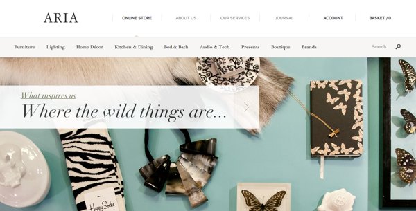
- Large, easily-read type works best for an older audience and looks classic and timeless.
- An extremely clean interface (that relies on photography to add interest) makes navigation simple for less web-savvy users.
Functionality
When users interact with a design, they expect a hierarchy of information and function that makes intuitive sense.
Designers are perpetually afraid of their work being perceived as boring or “safe.” But the truth about web design is that users want to feel comfortable when they interact with a site. Any sort of learning curve is not appreciated, and beautiful but confusing design innovations must be sacrificed to this imperative. Follow the example of this site, and employ common principles such as:
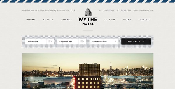
- Buttons should be immediately identifiable; it’s especially helpful if their color stands out from the rest of the page.
- Essential information should be highlighted and high up; for this example, the contact information and address of the hotel are key, so they’re almost the first thing you see.
- Make forms and fields as simple to fill as possible; the pop-up calendar here is a helpful addition.
Make sure that you’re prioritizing function over form, and you’ll find that a beautiful design will still result, with the added benefit of being just as great an experience to use as it is to look at.
