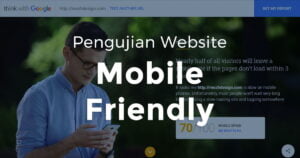
Pengujian Website Mobile Friendly
Pengujian website mobile friendly dapat anda lakukan sendiri dengan membaca artikel ini. ReeZh Design siap mewujudkan situs internet Anda ramah perangkat mobile.
Responsive Web Design | Useful List of Tutorials
The concept of responsive web design, started by Ethan Marcotte, is that our web layouts should respond to the user’s device.
Responsive Web Design – Interactive Infographic
Responsive web design is an approach that suggests website design should respond to the user’s behavior and environment.

Responsive Web Design, is your website Responsive?
Responsive web design are the best way for your business to reach your website visitor with many devices they have to access your website.
Infographic: Responsive Web Design, a paradigm shift in the industry
Responsive Web Design, a paradigm shift in the industry. Browse more data visualization.
How to Choose a Responsive Images Tool
How to Choose a Responsive Images Tool Design Modo: How to Choose a Responsive Images Tool
Responsive web design case study: Zee
Last week we launched the new Zee website – Zee is my company here in Brazil. We did the site in a single page, presenting the company, our works and keeping the focus on content and in a simple design. I decided to write this case study because the main chalenge we faced was to […]
Expand the Visibility of Your Website – Hire a Responsive Web Designer
Responsive web design helps keep your website intact on any digital device it is browsed through. Learn why you need responsive web design and how responsive web designer is different from a general web designer. read more
Responsive Website Designing – A Primer
Responsive website designing is going to be a force to reckon with in coming times. It essentially websites to adjust them in accordance with the resolution of site on which they are being used. read more
Update Your Website With Responsive Web Design
Responsive Web Design (RWD) is new approach developed for the web designers who want to their sites to have worldwide usefulness especially in the mobile field. If you want to have a wide appreciation of your website across as many platforms and browsers as it passes from, then you must have a deep knowledge about […]
Reducing the Chances of Marketing Pitfalls With Responsive Web Design Joomla Template
With more and more users switching to handheld devices for their browsing needs, webmasters are continuously investing in a compatible web layout design that works as well with the required resolution. However designers still have difficulty in handling the new tricks of the game. It’s a problem, that most commonly surfaces for web user through […]
10 Premium and Fully Responsive Web Templates from MightyDeals
Design Modo: 10 Premium and Fully Responsive Web Templates from MightyDeals
Why You Should Consider Using Responsive Web Design
Responsive Web Design is a design method that involves making one version of a website that works no matter what type of device you’re using. When a site is put together in this way, you could navigate to the same page on a desktop computer running Chrome, an iPhone running mobile Safari, or an Android […]
Learn About Responsive Website Design!
Do you want to design your website so that it responds to all forms of devices used for searching the internet? Read this article to learn how using Responsive Website Design, or RWD, for web design can attract visitors from every avenue! read more
Responsive Web Design As A Substitute Of Mobile Web Sites
A web design can be said to be responsive only when it get adapted to the different operating system and the platforms used by the visitors to access the website. The responsive web design is day by day becoming more and more popular because the responsive web design makes the website owner feel that there […]